

ChangedStars TTRPG Handbook
Logo, asset, photo editing, and layout design for indie Tabletop Roleplaying Game ChangedStars’s 304 page handbook
2024
About
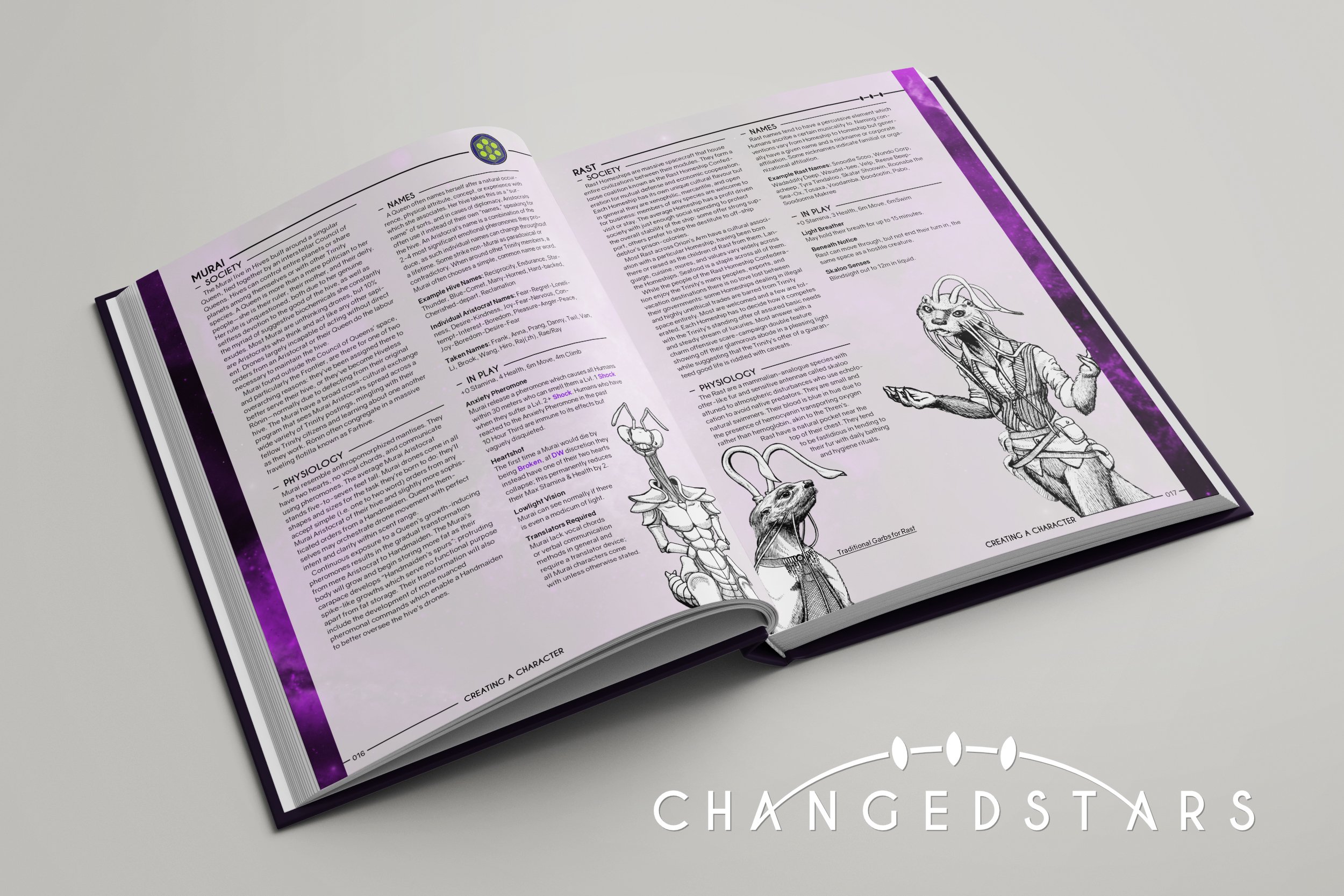
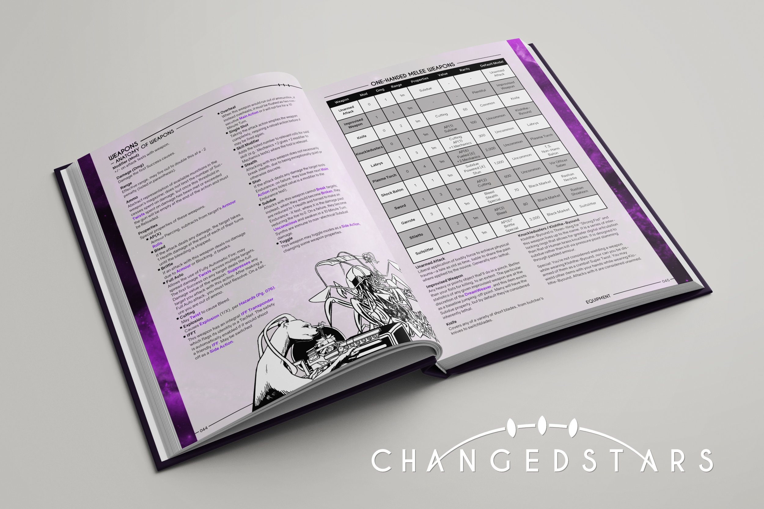
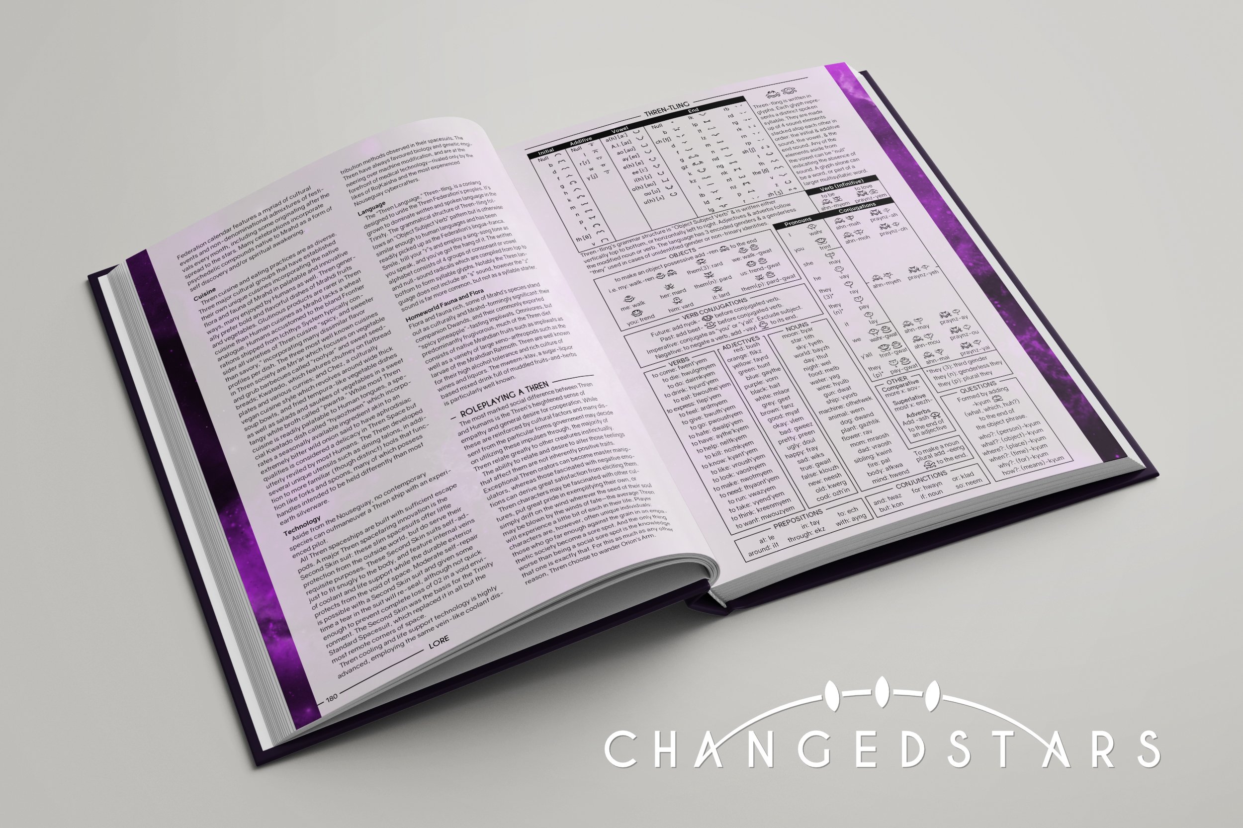
ChangedStars is a Tabletop RPG that launched a Kickstarter to fund a fully designed handbook (such as the books used to play Dungeons and Dragons and other TTRPGs) that is intended to be printed. The book aimed to contain everything one would need to play a game of ChangedStars, including the rules, options for creating characters, tips on how to run it, lore and information of the world, enemy and NPC stat blocks, and an adventure to run.
Initially, I joined as an advisor for the project during its Kickstarter launch and would occasionally help design some assets that were small, one-off projects. I answered questions asked by the project leader relating to graphic design, such as pricing and alternative options that would fit into different budgets. I offered critique when the initial layout designer sent work into the group chat. I also created the logo for ChangedStars after some brainstorming with the other Kickstarter designers. Lastly, I helped create all the assets and some layouts for Twitch streams relating to the game (play sessions, developer streams, etc.) that became the basis for all the major streams.
After the Kickstarter promotion finished the layout designer had to step down for personal reasons, and since I was already familiar with the project and had layout experience, I came on board officially. I handled the layout and updating some assets to make the book look more cohesive, while others handled the writing and art. A much smaller version of the book created for the Kickstarter served as the base for the aesthetic of the book, though I had to update the design to meet the printing end goal and space constraints. I also gave advice and helped workshop some other aspects of the book, such as the spaceship maps and writing inconsistencies. Since much of the art was not digital, I also helped edit the physical art to the same quality as the digital pieces as well as remove the backgrounds.
We are now in the last leg of the project and are currently reviewing feedback of the backer version we sent out and are hoping to finalize the book soon so that we can start selling the digital copies and send it off to print.


Highlights
Text Wrapping
Since the book is meant to be used for play, we wanted to incorporate a playful element in it. The text wrapping around the images helped save space so that we could fit as much content into the book as possible, without making it seem too crowded. This allowed the art to draw the reader into the layout, despite the art not being designed for it. To accomplish this, I either extended or cropped out the backgrounds of some art (with the artist’s permission) to allow for better text wrapping and to save more space simultaneously.
Updated Assets
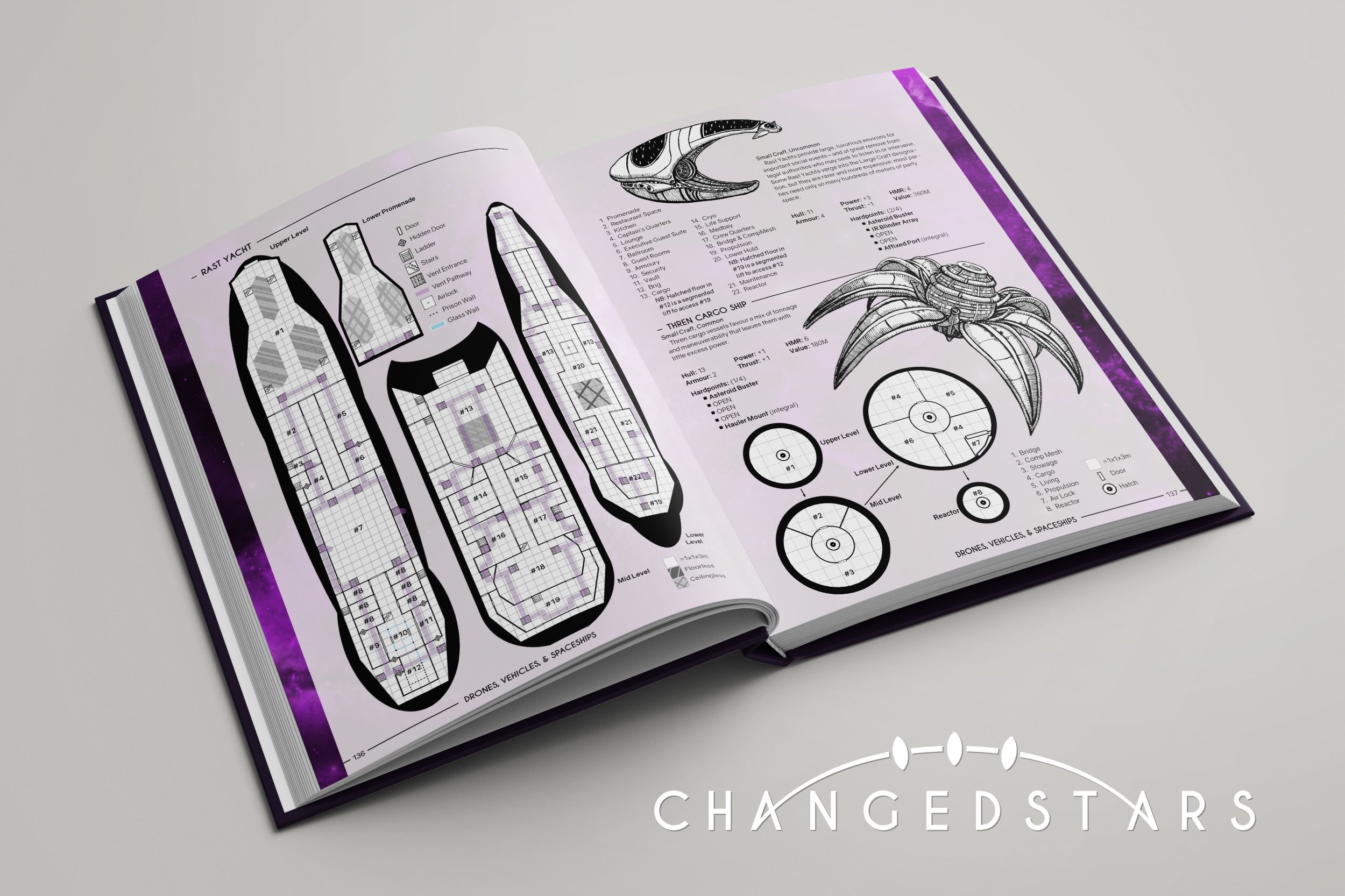
While the character sheet and maps initially created for the book were serviceable, they were created before the overall design for the book was finalized. These pages stuck out like a sore thumb with their clashing aesthetics. And though serviceable, there were still improvements that could be made in not only the aesthetic, but the usability as well (such as making them printer friendly or more legible). I describe the specifics below in the “Assets” section under the images.
Logo and Signage System
The Trinity, an alliance prominent in the lore of ChangedStars, was an obvious choice to be the feature of the logo. The challenge was trying to incorporate the idea of the Trinity without the logo becoming too elaborate or dependent on color, all the whilst evoking sci-fi. I played around with different elements of the separate emblems related to the Trinity. After presenting and refining multiple sketches with the team, I eventually found a way to connect it to the text to create a cohesive logo. Afterwards, I created an alternative logo should the arc and the text ever needed to be separated, allowing for more versatility in the logo usage.
Additionally, I made assets utilizing the idea of the logo and found numerous ways to incorporate them into the signage of the book. This created a cohesiveness throughout the book while adding visual interest that aids in hierarchy. The ease of hierarchy was especially important since users often need to flip through the book to find a specific part to reference, and the signage is more eye-catching at a glance.
Navigation and Links
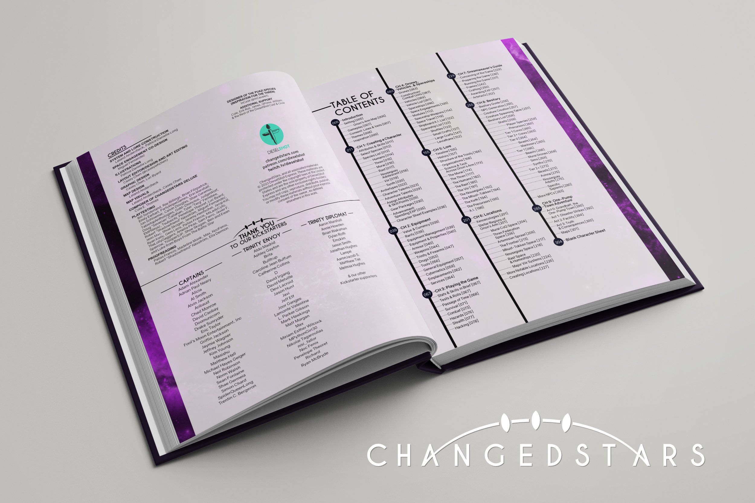
TTRPG handbooks are rarely read cover to cover. They are reference books meant to be used during a game. Because of that, navigation for this book was crucial. The hierarchy makes it easy to look for specific sections whilst skimming. The section names on the bottom make it easier to navigate when opening the book to a random page to begin searching.
The purple text elegantly indicates a hyperlink (since this book will also be sold digitally), and for those with a physical copy the purple indicates that the term is in the book for them to reference. This is especially helpful for readers since most of the terms are common words (such as Break, Shock, and Cognition). Page numbers were also included where deemed necessary so that this book can function both digitally and physically. While we had hopes of including a proper glossary to further the usability of the book, we did not have enough room to include it and came up with this as an alternative solution.
Challenges
Page Limit
Space was a huge concern for this book, since we had a strict page limit to adhere to because of budgeting. It was hard to properly gauge how much text would translate into how many pages due to the varying sizes in art and the need for diagrams and tables. The writer and I had to work together on many rewrites and cuts in order to meet the page restriction, all while including everything that was promised in the Kickstarter, and balancing the sections so that they did not seem like afterthoughts or became outright unusable.
Layout Changes
One of the best solutions to saving space in the book was reworking the base template. The circular logo asset was initially used as a playful highlight to the page numbers, but we soon found that it took up too much space. This and other various changes to the overarching layout got us many pages back, but many of these changes were done when the book was already halfway done. Despite my best efforts to set up master pages and text styles to ease this process as much as possible, a lot of time was used adjusting previous work. It was worth it in the end since we had come to the conclusion that no more major cuts could be made while keeping the main goal of the book: allowing players to run a game with a single book while adding atmosphere through the addition of art.
Art
ChangedStars as a game system was long in development before the Kickstarter. Because of this, many art assets were made in the early days when games were run to playtest the system and before the artist got access to digital drawing. Because of this, editing needed to be done to make the art a consistant quality from one page to the next.
The art also had to be edited so the backgrounds were transparent, but the line art was still filled in so that it could pop off the page. While easily done with digital drawings, the physical ones required careful hand editing. Some of the art with backgrounds also had to be adjusted to better fit the space the text left within the book. I learned a lot of ways to work smarter and not harder with this editing process. Though time consuming, the final product speaks for itself.
Project Management
We were a team of three working on a whole book. There were others that helped, but the bulk of the project was ours. Even so, coordinating three people’s efforts was difficult and initially lacking. One of them made efforts to manage the project, though unfortunately those efforts did not help as much as we hoped. As the project continued to move forward, I stepped in to facilitate the management.
This required a lot of listening and not just delegating. I had to learn the systems that each of us worked on. While the challenges of this role were initially outside my professional comfort zone, I was ultimately able to increase group efficiency and improve the rate of progress. I created to-do lists, organized tasks by priority, and directed creation of communal documents to help ease communication outside of meetings. Additionally, I started to divide tasks into what could be done collaboratively or individually towards the end of the project. While in-group communication presented a challenge, I have learned a lot from it and continue to improve in this aspect.
Logo and Assets

Character Sheet

Redesigning the Facility Map

Redesigning the Space Map

Weekly Schedule during Kickstarter Promo

ChangedStars Game Stream

Developer Stream with Guest Screenshot

Planetmoji Examples

Image Editing: Shortening

Image Editing: Removing Background

Image Editing: Removing and Extending
Assets
Character Sheet
The initial character sheet had one major flaw: it was too colorful. Character sheets are a tool that will be used over and over again, and though technology allows for digital copies of the character sheets to be used during play, some people still prefer the classic pen and paper approach. Thus, the color and full bleed of the previous design would be unfriendly to use for those that want to print a physical copy. Though less elaborate, my character sheet is printer-friendly. I added visual interest back in through the signage used in the book, making it more cohesive in aesthetic as well. I also updated the layout of it, trying to think of what information is most important and what needed more room to write details. Lastly, with ChangedStars’s inclusion of LGBTQIA+ themes, I made sure to include pronouns and gender for characters on the sheet, since the sheet may be used by the person running the game as well as the player.
Space Map
This was another map in need of an update based on aesthetics alone. Some of the challenges were maximizing the map’s space while making sure it wasn’t blocked out in an awkward way from the rest of the book. If we made it take up a full page, it would be easy, but we had already made many cuts and couldn’t afford the space. I tried giving this map the same treatment as I did the other maps. However, since it was depicting space, it didn’t evoke the correct feeling when set against a light colored background. So instead, I inverted the whole page and designed it as a poster—a standalone piece.
Though we wanted to keep to the limited color pallet like the rest of the book, we found it was not worth losing our options to convey information, since that was the map’s primary goal. Because we added color as an important aspect to the piece, we wanted it to be as accessible as possible. After reaching out to some colorblind contacts, I incorporated their critique to make an aesthetically appealing, functional, and accessible map.
Weekly Schedule
This was my first venture in playing with how the signage could be utilized for ChangedStars. Used back in the Kickstarter promotion days, the color pallet is outdated. Though some of the events would be reoccurring weekly, others were not and the future schedules were not fully set in place. Because of that, I made the blocks for the events more flexible instead of designing around the events for that one week alone.
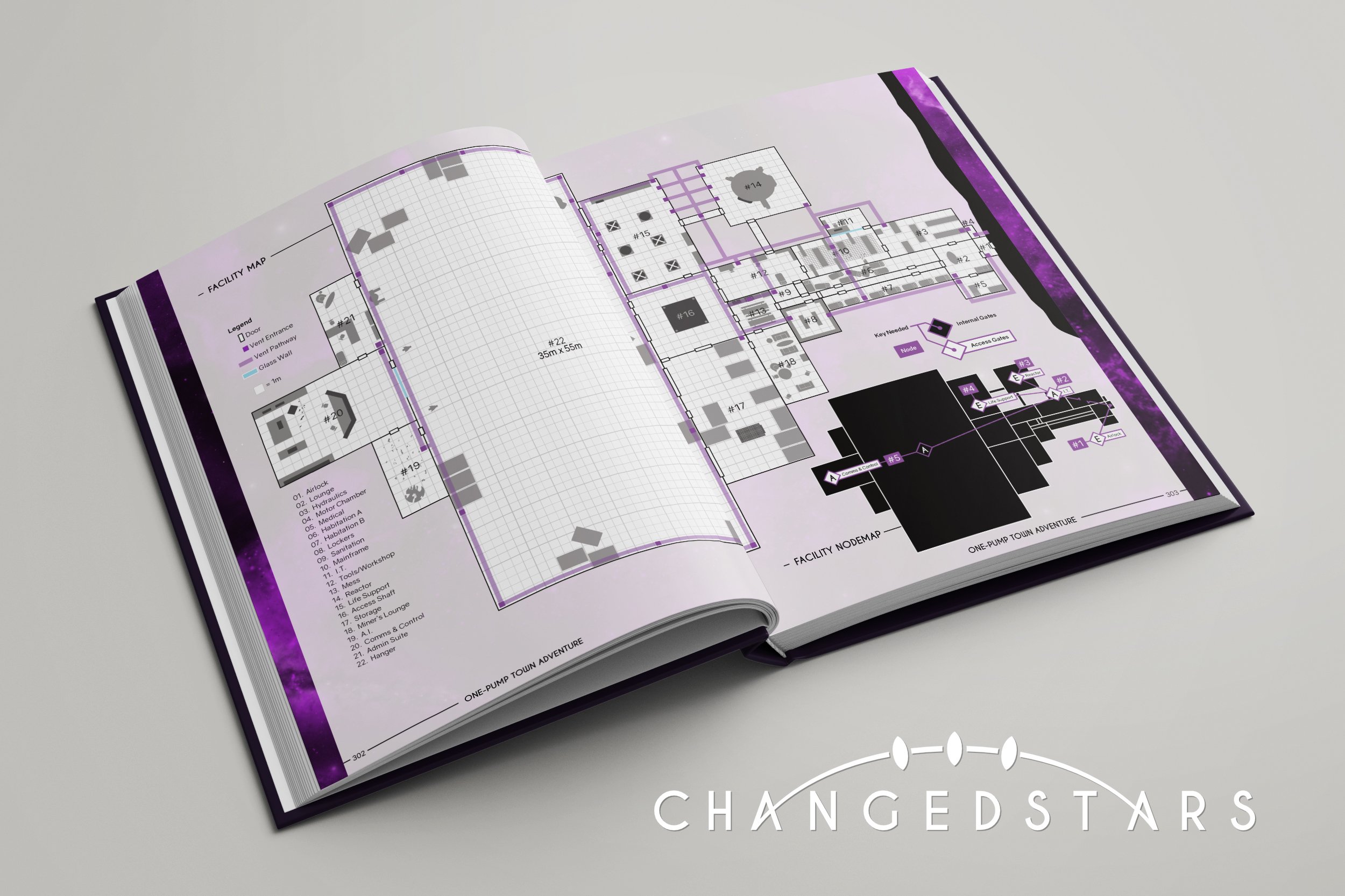
Facility Map
The original map maker tried hard to avoid having anything be in the fold of the book. He was trying to balance having the map be a visible and usable size, while not having anything lost to the gutter. So, he split the map into two, with a third map showing a less detailed but connected view of the map. While redoing the maps to fit the with the aesthetic of the rest of the book, I realized there was a large, mostly empty room in one of the maps. After confirming with the original designer, I played around with having that room lie in the fold and writing how large that room is to clarify what would be lost in the fold (which is helpful anyways since now people don’t have to manually count the squares on the grid for the largest room). This maps design also helped set the guidelines for how the spaceship maps should be designed (which I did not personally create but did advise on as the map maker was learning the program and this new aesthetic.
Planetmojis
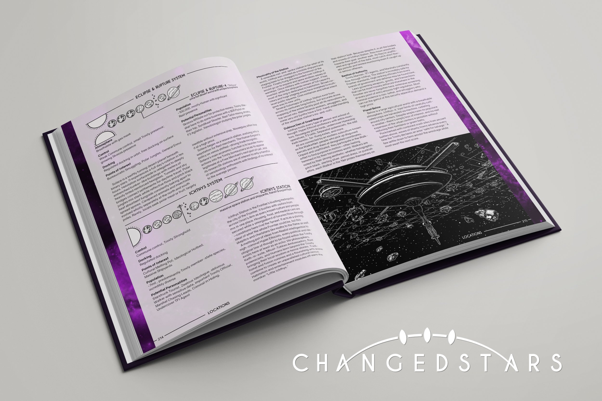
The “Planetmojis,” the symbol based solar system map used in the location section, was a collaborative effort between me and the artist. We needed to create a cohesive way to display planetary information, like a planet having six major moons, or how to differentiate between a moon and a dwarf planet. She created the symbols used, and I put it all together in a way where they were consistently displayed throughout the “Locations” chapter.
Stream Frame
Being a player in one of the games hosted on the DieselShot channel, I was already familiar with what the needs for the Twitch streams were. We had already been working on updating the layout, though it was through repurposing already made assets. ChangedStars had no assets already made, so I had a clean slate to rework the whole layout. After multiple sketches on where to even place the pieces of the frame, we decided on one we though would work best. Then, I got to working on the actual frames that would go into the layout. Since the streamer would have different guests and/or different characters almost every game, I had to make a nameplate that he could edit and upload himself.
After making the frames, nameplates, and stream starting screen, I furthered my learning on how Streamlabs OBS works to create a flexible layout that would adjust to varying number of players. We also have repurposed these assets to include streams centered around two screens, no screens, or featuring artwork. The overall layout continues to be used for other games, just with different frames and colors to fit the needs of the time.