

Rékèlæ Renew
Brand identity for a waste disposal company centered on environmentalism along with its subsidiary, Container Pros
2018
Goal
Given the name Rékèlæ, I was to create a whole brand identity for a fictional waste management company. The process included competitive and visual audits as well as simulating the absorption of a subsidiary company.
Required assets included two logos, one for the parent company and one for the subsidiary, a business suite, four ephemera, a marketing sheet for a product of the subsidiary, a website mock-up, and a graphics standards guide.

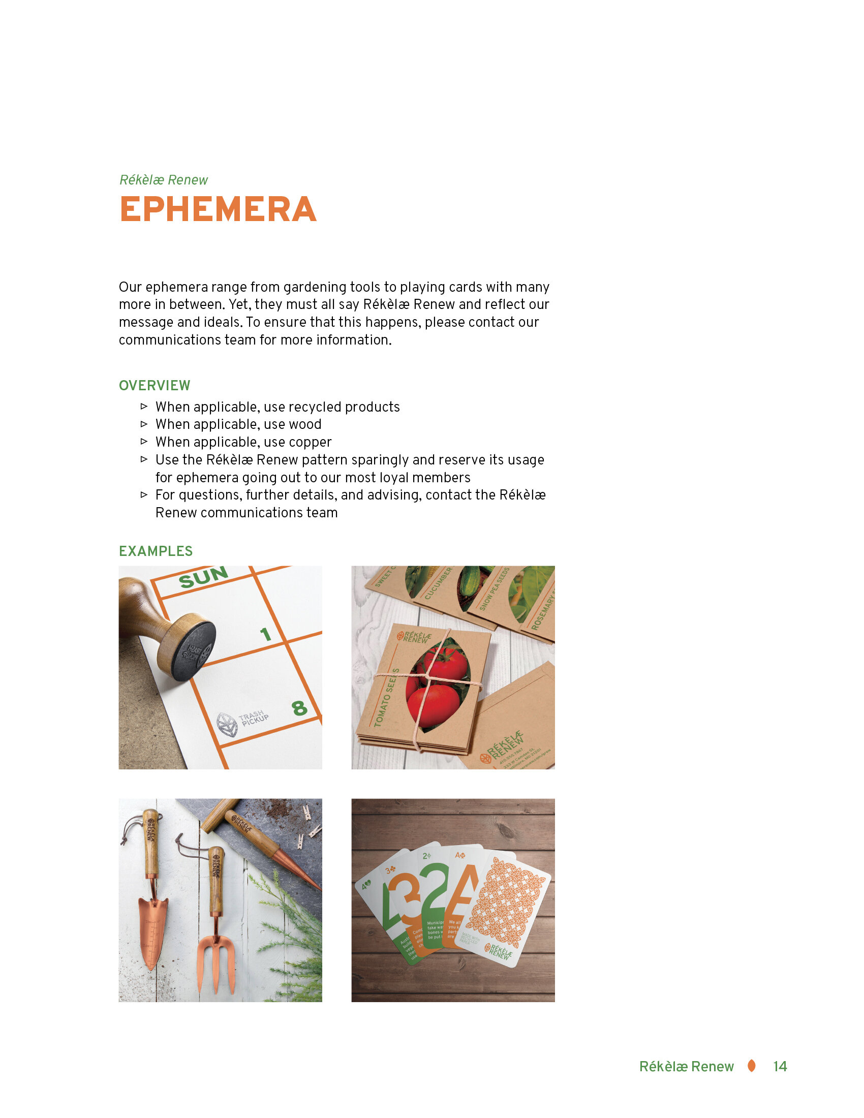
Ephemera - Calendar Stamps

Ephemera - Gardening Tools

Ephemera - Playing Cards with Facts

Ephemera - Seed Packets

Marketing Sheet - Front

Marketing Sheet - Back

Website - Home

Website- Product Page

Website - About


Highlights
Research
When given the industry of waste management, my immediate thought was how to stand apart from and compete against a company that was named after the industry itself—Waste Management Inc. Though I prioritized my research on Waste Management, I couldn’t ignore the other competitors. Researching them all also helped me find common themes in their mission statements, language, and service offerings. After researching the competitors, it was clear that there were already many “catch-all” waste collection services. The companies that stood out were the ones that collected special kinds of waste, such as medical waste. What I didn’t see though was any easy access to compost. That’s what I decided to have this company focus on.
Colors
With many of the companies emphasizing sustainability and environmentalism, it was no surprise that green showed up often in the visual audit. Many waste management companies accompanied with with blue, probably to extrude dependency. So that color combination was right out. There were a couple logos that used red prominently, without any green, but those logos seemed too out of place in this industry. I decided to still use green, it was too fitting to pass up, but accompany it with a different color. Though Waste Management was the only company to do the same, because of how well known they are, I had to avoid green and gold. I instead chose orange, a more inviting color than brown, to reflect the focus on composting.
Application of Mission
It wasn’t enough to just talk about sustainability and recycling. The mission statement would be pointless if the company was blatantly hypocritical in their statements so it was important to find ways to apply those values into the design. That’s why I chose to print the business suite on Neenah ENVIRONMENT® Papers, which are all post-consumer fiber papers. I chose one that was made completely by post-consumer fiber. While they did offer a white option as well, I wanted it to be obvious at first glance that the paper itself had something more to say.
Ephemera
While branded pencils and notebooks are common, those giveaway items no longer stand out nor do they speak to the target audience of Rékèlæ Renew. Since I was focusing on the composting aspect of the company, gardening was the most logical theme. I chose to do a stamp instead of a calendar since most people already have a calendar, especially if it is in the middle of the year. And though playing cards are common, I thought it would be a fun way to spread facts and correct misconceptions about recycling, while also expanding ways to apply the logo.
Challenges
Logos
Waste management finds itself in a difficult pitfall where iconography that is associated with the field is not visually appealing or too commonly used (such as a leaf for environmentalism). The other pitfall is that many of the competitors use letterform marks. Rékèlæ Renew especially found itself in a difficult position when considering letterform marks since Republic Services was a major competitor. After many sketches, I arrived at a pictorial mark that easily conveyed the mission while differentiating itself from other leaves by adding a letterform aspect.
Subsidiary
Absorbing a subsidiary company, even a fictional one, brought about questions that needed to be considered. The biggest one is “What type of brand architecture should be utilized?” To answer that question requires thought about whether or not to keep the original subsidiary’s name, how present the parent company should be in the branding, and the benefits and downfalls of each brand architecture in this instance. It’s after deliberating all those factors that the design can be done.